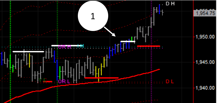
This is the screenshot of today’s (29th of February 2016) action in a 4,500 ticks chart.
The market has been sideways trapped between the Opening Range High (OR H in the chart in purple) and the Opening Range Low (OR L), roughly 1948 and 1941 levels.
Then at 10 o’clock Chicago time a collection of blue bars appear (high volume entering the market detected by the XBP Tape Players indicator). These bars appear right at the resistance level identified by the XBP BB SR Levels indicator, seen as the horizontal white bar. But then shortly after that same level that was a resistance, transforms itself in a support, seen as the horizontal red bar from the same indicator. This flip of forces signalled the imminent break to new highs.
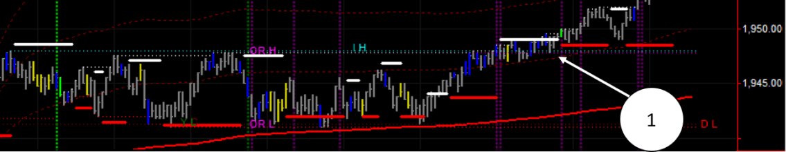
In the following screenshot you will see the same action but in a 1,500 ticks chart. We use these charts to time our entries. The ideal scenario is to enter in the direction of the predominant force in the 4,500 ticks chart, in this case upwards as the resistance changed to support, once the 1,500 ticks chart aligns itself, i.e. it prints a support.
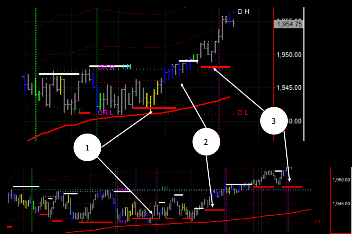
If we put the two time frames together we can easily identify the low risk entry points for today’s action:
If you are not familiar with the tick bar charts you can check this previous post where I explain the benefits of using tick charts over normal time based charts.
