I must admit that I love anything that comes from Japan. I’ve been there more than 5 times and I’m looking forward to go back. Still, I’m not a fan of candle sticks. They may have worked in the old days of slow fish markets when the study of daily prices with candlesticks could give you and added advantage over the other traders that were not using such a technique. But recently I’ve discovered Heikin Ashi, which means “average bar” in Japanese (or that’s what they say).
Heikin Ashi charts look like smoothed candle sticks but they can give us clear trading signals that help us enter a trade and/or stay on a trade while a trend prevails.
Let me share with you a screenshot from Investopedia:
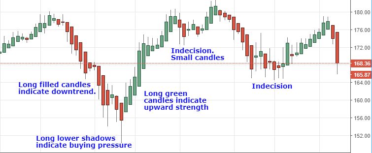
The rules are pretty simple:
- Candles with shadows on both sides mean indecision/trend changing pressure
- Candles with shadows only on their directional side mean strong trend
- Green/bull candles with no lower shadows mean strong uptrend
- Red/bull candles with no upper shadoes mean strong downtrend
You can read the full article in Investopedia by just clicking the chart.
The calculation of the candles are different from the normal candles, in summary (again from Investopedia):
- Close = (Open + High + Low + Close) / 4o This is the average price of the current bar
- Open = (Open of Previous Bar + Close of Previous Bar) / 2o This is the midpoint of the previous bar
- High = Max of (High, Open, Close)o Highest value of the three
- Low = Min of (Low, Open, Close)o Lowest value of the three
I like this candle style as it gives a extremely clear signal specially on the exit side. You can enter a trend, based on the XBP indicator or the indicators, and ride the trend until the Heikin Ashi candles indicates the opposite.
To prevent the candles having too much sensitivity I recommend to apply them to a time frame higher than 1 minute, I’m personally swithing constantly between 2 and 3 minutes charts. This will give you a balance between fast response and too of an early one.
As it is always recommended, any indicator shall have confirmation from another indicator for a high probability trade. In the screenshot below I’m showing the market action for mini-ES for the 29th of August 2018 with a tick chart on the left with the XBP indicators and a 2 minutes chart on the right with Heikin Ashi candles and the market internals indicators ($TICK and Advance/Decline):
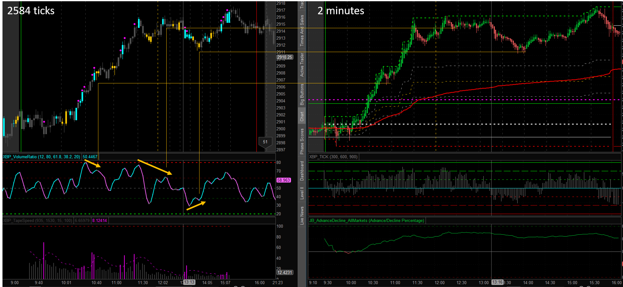
I’ve added the yellow arrows to highlight the moments that the XBP Volume Ratio indicator had divergence with price, which is the main signal that we are waiting for on this indicator. The straight yellow lines help you to identify in both charts the price action that was occurring in that moment so you can correlate the action with the signals given by both the XBP Volume Ratio indicator and the Heikin Ashi candles.
I encourage you to try the Heikin Ashi candle charts, replace your time chart that is using bars or candles, which do not give that clear signals, for these “average bar” calculated candles, follow their easy signals and let me know if your trading improves thanks to them.
Note: I want to clarify a recurrent critic that I receive and that I’ve also saw on other trading websites and books about the example screenshots. Some people say that the screenshots are always from an “ideal” scenario where the signals given by the indicators predict correctly the future price action. Let me remind you that trading is 90% seating in your hands waiting for that clear high probability setup that you can trade. This is the main reason why some many traders fail to succesfully trade. We all, including me, tend to “force” what we see in the market to our own perception of which direction the market will go. Then we enter the market, and most often than not, the market just goes in the opposite direction. So, sharing screenshots where the indicators correctly predict the market behavior is not cheating but a way to show you that patience in trading is the skill number 1. And all traders, even the most succesful, miss good trades on a daily basis. This is just part of the job.

1 Comment