Monday the 5th of February 2018, a day to remember. The US stock market declined 5%. The reason? As always, nobody really knows, and actually it shall not even matter. For day-trading these kind of days are actually good. If you were able to spot good entry points, in the right direction, you could have made a killing yesterday and today you could be a happy human being 🙂
I’m a defendant of tick charts. They provide a clearer picture of the true action in the market. With such a ferocious and rampant day like yesterday I have a good opportunity to show you how useful tick charts are.
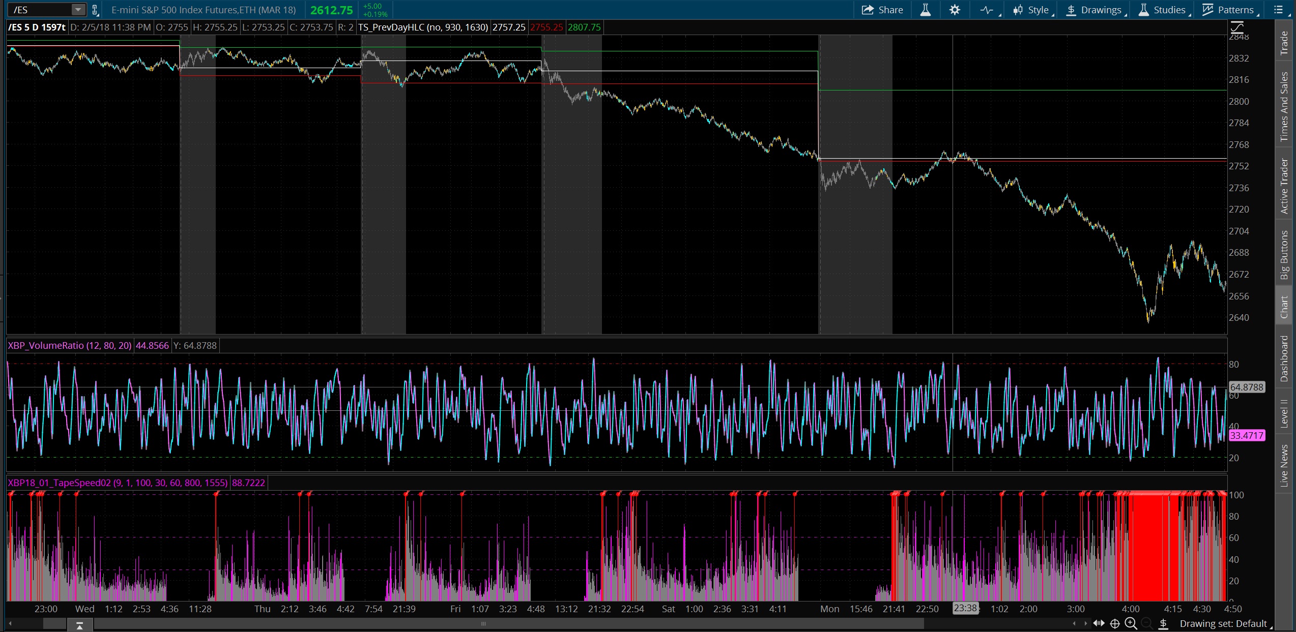
The following screenshot is a 1597 ticks chart from the Tuesday the 30th of January to the 5th of February 2018. Each day is divided by the transparent gray cloud that marks the intraday session.
There are 2 important observations in this chart:
- The number of bars: As a tick chart only creates a new bar whenever a certain number of ticks have occurred, in our chart 1597 ticks, the more bars the more ticks occurred. You can clearly see how the number of bars are bigger on Monday the 5th and Friday the 2nd (usually Fridays are quieter (i.e. smaller) days.
- The speed of the bars: The lowest indicator is the XBP Tape Speed indicator, which measures the speed at which the bar has been closed or completed. The aim is to detect “fast” bars or cluster of bars to detect big players entering/exiting the market. You can see how around 4pm (4am in the chart as it is configured with GMT+8 time zone), the speed of the bars is extremely high and not only the speed but as well the quantity of bars at that speed.
The speed of the market is really important for day traders. In extraordinary fast markets we can see ourselves out of the market. Retail trading platforms will not be able to digest all the information coming from the markets, they will report the wrong picture, your orders filling will be unpredictable and we, as humans, can be even not be able to decide that quickly in which direction to enter the market or if we shall exit or not in case we are in already.
As many things in life, the sweet spot is a wide range between the two extremes. Too slow markets are dangerous as we can enter and exit the market many times with small losses as we are expecting a major move in one direction that never happens. Too fast markets are even more dangerous as the trading platforms can become unresponsive or unsynchronized with the market as well as we could have difficulties deciding what to do.
So, in case you missed yesterday, don’t be mad at yourself. It was maybe good after all.
For comparison sake, let’s see at the same chart but now with 1 minute bars instead (and without the intraday session as the whole chart didn’t fit in one screen):

In this case, all days seem equal except for the step decline in price in both Friday and Monday. Here it seems that at any time you could have entered the market as all bars seem the same to the rest, but thanks to tick charts we know that that was not the case.
Note: Tape Speed indicator only works in tick based charts.
