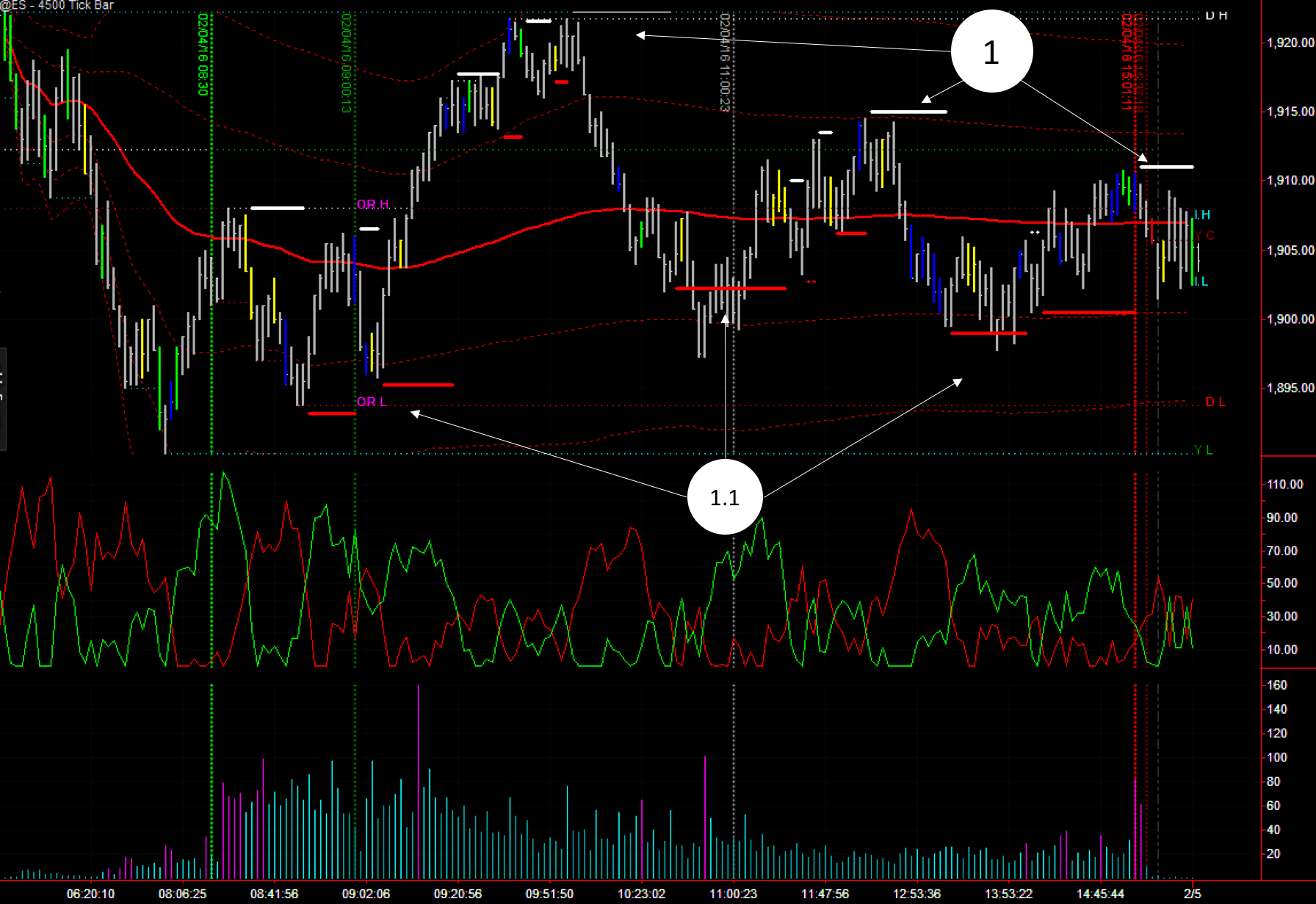
1) XBP BB SR Levels: Normally we use 4,500 tick charts that have enough detail to place good trades and at the same time are a high enough time frame for us to see “the big picture”, but on days like today, where the market goes sideways, is not that clear. Then, the best way to get the big picture is to scale up to the weekly charts time frame of 13,500 ticks (4,500 x 3):
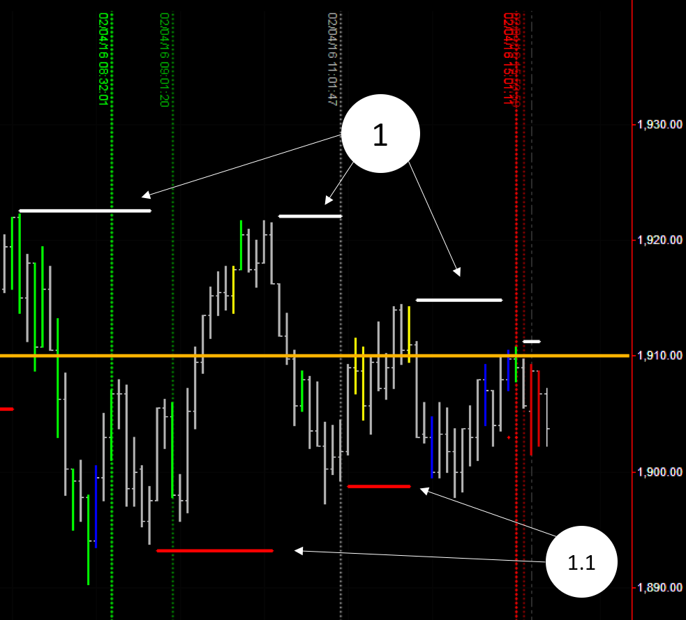
Now we can see better which levels are the most important ones, and the picture is clear, a triangle. Lower highs and higher lows, form this triangle, that normally ends with an explosive move to the winning side and a trend on that direction that will last few days. (Level 1910, in orange, is the key market level detected on last week’s weekly analysis)
2) XBP VWAP: Price danced around the main VWAP, which is typical of sideways days. Good signals when touching standard deviation levels, finding good supports and resistances during the day.
3) XBP Market Key Levels: Resistance of the day at Intraday High and never crossing below Intraday Low, not even Open Range Low. This adds to our analysis of a sideways day.
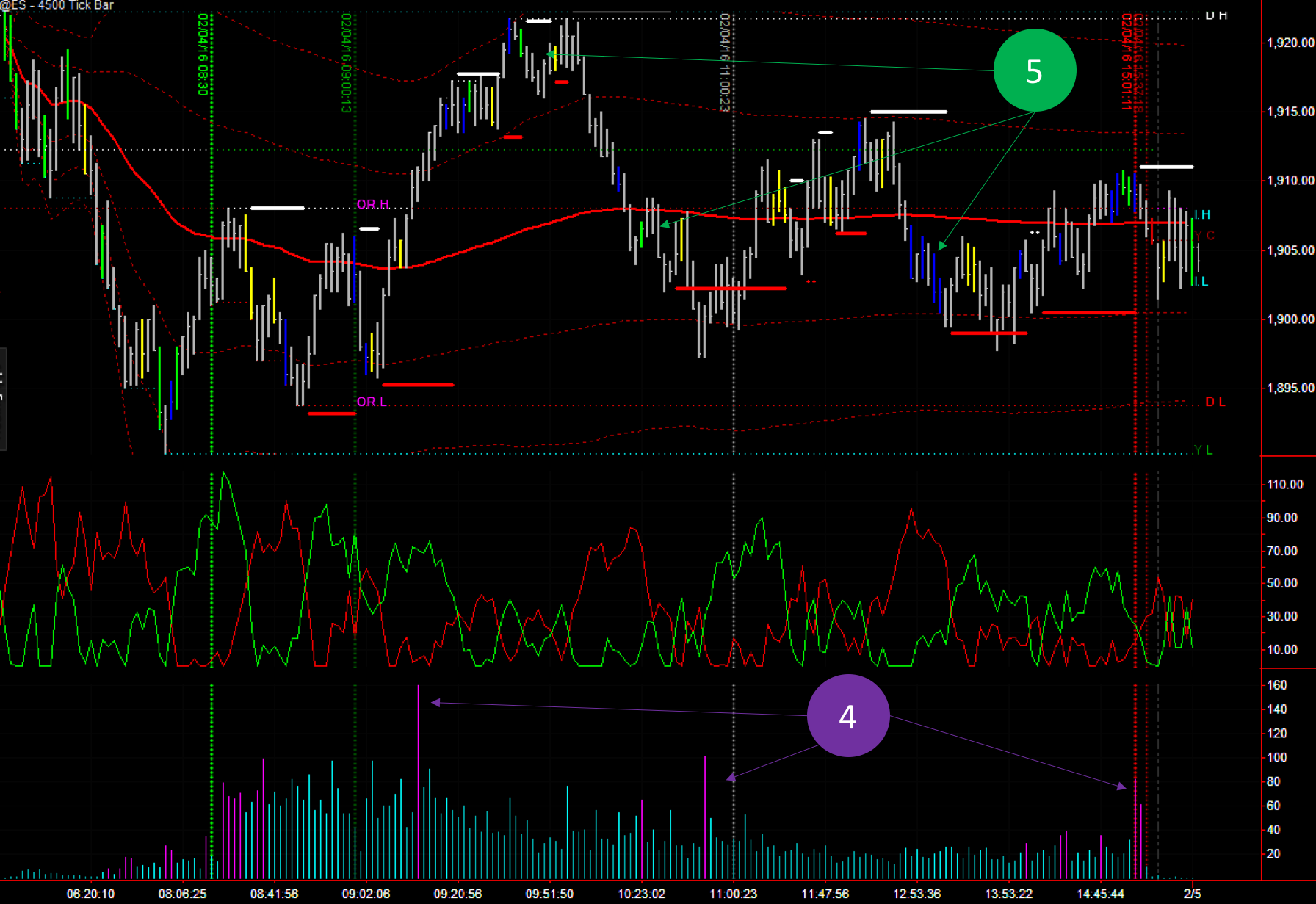
4) XBP Tape Speed: Little clues in the tape speed as well, the first high speed bar was most probably due to stops being hit. The second one, minutes before 11:00 o’clock is quite a typical one (check it out in the different days). Seems like big players just exit or flip sides right before lunch time. Last thing to notice is the lack of high speed bars at the end of the day. Normally the last 10 to 5 minutes of the day have the highest speed bars, but not today…
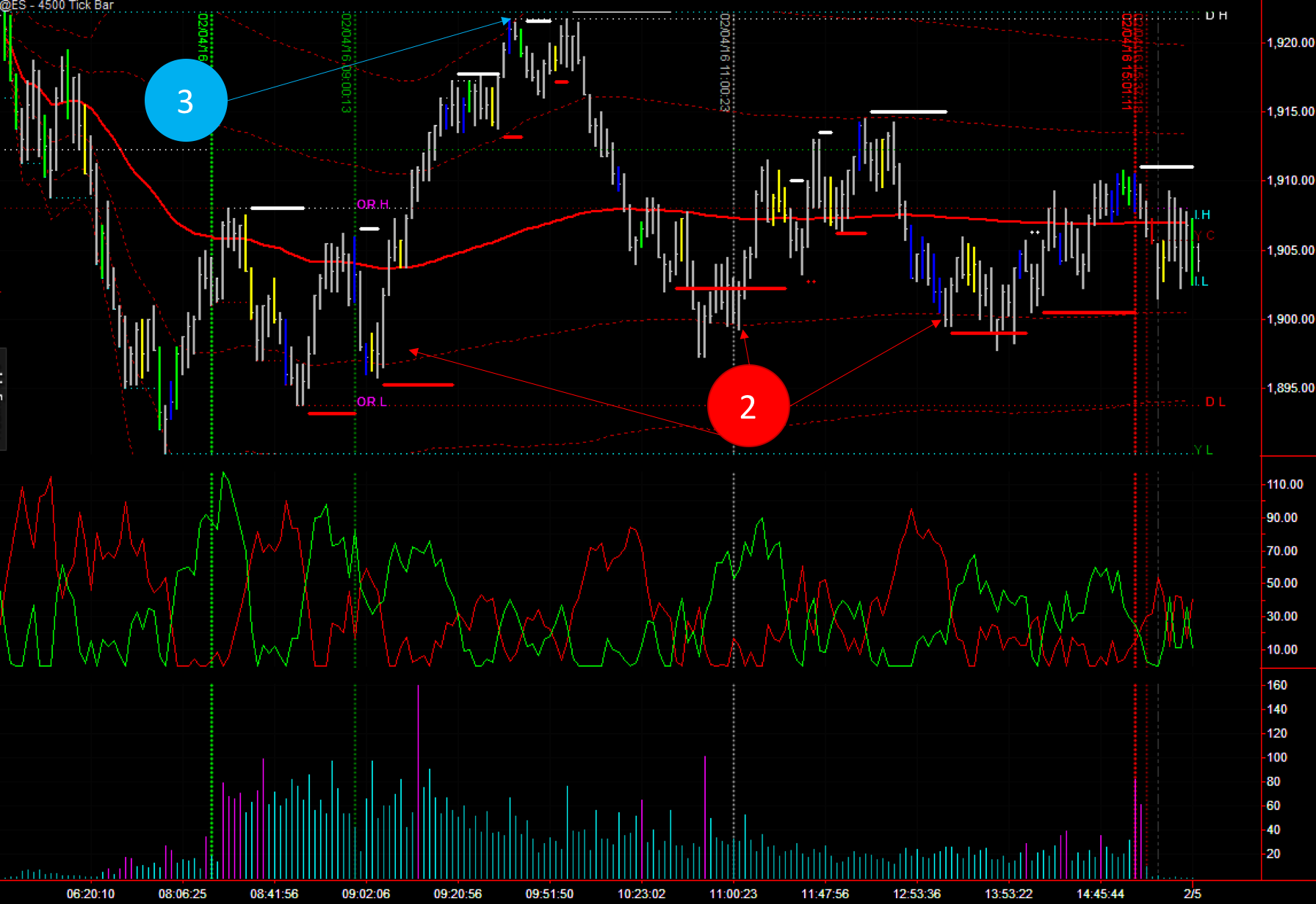
5) XBP Market Players: Check the green bars, right at the top around 9:45, shorting the market and later at 10:30-ish marking the bottom of the market. The cluster of big players’ blue bars at the same level as the 3rd green bar of the day could give us a clue of where the big players are entering and betting the market.
Pattern to learn: Today is the perfect example for a typical reverse pattern that you will see over and over again, and it happened twice today!
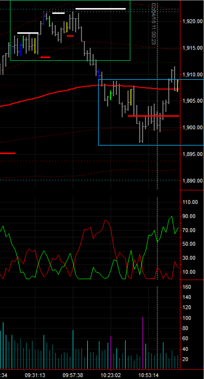
Let’s remember quickly what the the green, blue and yellow bars are:
- Blue bars: High volume bars. We identify them as big players entering/exiting the market.
- Yellow bars: Low volume bars. We identify them as small players.
- Green bars: The highest volume bars until that moment. Imagine them as really bright blue bars.
These bars help us to spot where the big money is entering/exiting the market, blue and green bars, and where the small players have been left alone in the wrong side of the market (yellow bars at the top/bottom of the market).
The pattern to form a top/bottom is always pretty similar. Let’s imagine the case of a top. The market is raising with normal grey bars and then a blue or green bar appear. The market then will raise a bit more and a yellow bar will appear. Then the market will start dropping and then you will see a blue bar where the stops of the small players are being hit.
If when you see this pattern you also see tape speed high readings and/or BB SR Levels being printed. Then you have a top/bottom.
Last but not least just a reminder that these past observations are not guarantee to be repeated in the future. You trade at your own risk and always have to have risk mitigation measures in places (always use a stop!)
Outlook for 5th of February:
- Key Levels: 1910, 1890, 1870
- Direction: 1910 is the level to beat. If they stay below, then bearish if above, bullish. Be water 🙂
